Table of Contents
ToggleLight blue walls have become a favorite for living rooms, and for good reason. This color family offers the calm of neutrals with a subtle boost of personality, working equally well in modern farmhouse spaces and sleek contemporary layouts. Unlike stark white or predictable beige, light blue adds dimension without overwhelming a room. It reflects natural light beautifully, making smaller living rooms feel more spacious while grounding larger ones with a soft, cohesive backdrop. Whether you’re planning a full repaint or testing accent walls, choosing the right shade makes all the difference in how the room feels day to day.
Key Takeaways
- Light blue paint colors for living rooms balance warmth and coolness, adapting well to different lighting conditions and complementing both modern and traditional decor styles.
- Top recommended shades include Benjamin Moore Palladian Blue for open spaces, Sherwin-Williams Rainwashed for natural wood elements, and Farrow & Ball Borrowed Light for superior pigment depth and coverage.
- Test paint samples throughout the day in your actual room lighting to assess how undertones shift, since light blue can pull green, gray, or lavender depending on natural light and existing furniture.
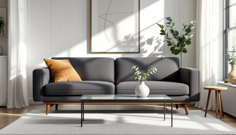
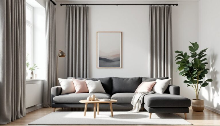
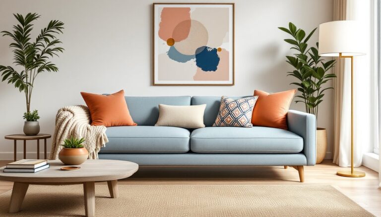
- Light blue walls pair beautifully with white or cream upholstery for a fresh coastal feel, or dark accents like navy and charcoal for visual contrast and grounding in larger rooms.
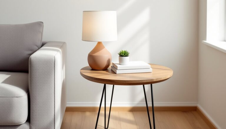
- Eggshell or satin finishes enhance the subtle dimension of light blue while remaining practical and washable, and investing in quality primer ensures true color payoff and reduces the number of topcoats needed.
Why Light Blue Works Beautifully in Living Rooms
Light blue sits in a sweet spot between warm and cool tones, making it versatile enough to adapt to different lighting conditions. North-facing rooms, which tend to pull cooler, benefit from light blues with gray or green undertones that prevent the space from feeling sterile. South-facing living rooms with abundant sunlight can handle purer sky blues without the color washing out.
This color family also plays well with a wide range of materials. It complements natural wood tones, think oak floors, walnut furniture, or pine trim, without clashing. White crown molding and baseboards stay crisp against light blue walls, while darker trim creates a more grounded, traditional look.
From a practical standpoint, light blue hides imperfections better than pure white. Minor wall dings, patched nail holes, and slight texture variations blend in more easily. It’s also forgiving during touch-ups: most quality paints in this range can be spot-applied without obvious lap marks if you feather the edges properly.
Psychologically, blue registers as calming and dependable, a solid choice for a room meant for relaxation and conversation. It doesn’t demand attention the way saturated jewel tones do, but it’s far from boring. The right light blue adds character without limiting your decor choices down the line.
Top Light Blue Paint Colors to Consider
Soft Sky Blues for Airy, Open Spaces
Benjamin Moore Palladian Blue (HC-144) remains a go-to for open-concept living rooms. It leans slightly green in natural light but reads as a true soft blue under incandescent bulbs. At roughly 350–400 square feet per gallon coverage (depending on surface porosity), one gallon typically handles a 12×14-foot room with 8-foot ceilings in two coats.
Sherwin-Williams Balmy (SW 6512) offers a cleaner, less green-tinted alternative. It’s a few shades lighter than Palladian Blue, making it ideal for rooms with limited windows. This one works particularly well when paired with bright white trim and soft neutrals, creating contrast without heaviness.
Behr Light French Gray (PPU18-08) sits at the borderline between blue and gray, a true “blue-gray” that shifts throughout the day. It’s a strong choice for living rooms that flow into kitchens or dining areas painted in warmer tones, acting as a visual bridge between spaces.
Farrow & Ball Borrowed Light (No. 235) is pricier but delivers exceptional depth. The higher pigment load in this brand means richer color payoff, often achieving full coverage in one coat over primer. It’s worth the cost if you’re painting a feature wall or a smaller living room where a gallon goes further.
Muted Aqua and Seafoam Tones
Valspar Peaceful (5003-2A) brings in subtle aqua undertones without veering into teal territory. It pairs beautifully with natural fiber rugs, linen upholstery, and light oak or ash furniture. This shade benefits from eggshell or satin finish to enhance its slight shimmer in daylight.
Benjamin Moore Woodlawn Blue (HC-147) is a historic color with staying power. It’s softer than pure aqua, leaning more toward a weathered coastal blue. Many designers recommend this for living rooms with existing warm neutrals, it doesn’t fight beige sofas or tan area rugs the way cooler blues sometimes do.
Sherwin-Williams Rainwashed (SW 6211) offers the most green-leaning option in this category. It’s a seafoam-meets-sky hybrid that works exceptionally well in homes with plenty of natural wood elements. The color appears lighter on walls than on paint chips, so test a swatch in your actual lighting before committing.
Behr Ocean Abyss (M480-1) is the palest of the aqua group, almost a whisper of color. It’s a solid pick for small living rooms where darker shades might close in the space. One note: this shade can pull slightly gray on overcast days, so factor in your climate and window orientation.
For more ideas on coordinating colors and decor, consider how light blue interacts with your existing furniture finishes and flooring.
How to Choose the Right Light Blue Shade for Your Living Room
Start by assessing your natural light. Paint sample boards (foam core or poster board work fine) with two coats of your top three shades. Move them around the room throughout the day, morning light, midday sun, and evening artificial light all reveal different undertones.
Undertones matter more than you’d think. Light blues can pull green, gray, or lavender depending on surrounding colors and lighting. If your living room has warm-toned wood floors (red oak, cherry), choose blues with slight green or gray undertones to balance the warmth. Cool-toned floors (maple, ash) pair well with purer sky blues.
Consider your existing furniture and fixed elements. If you’ve got a brick fireplace, leather sofas, or dark wood built-ins, test your paint choices against them. A shade that looks perfect on a blank wall might clash with a burgundy-toned brick or pull too icy next to espresso shelving.
Sheen affects perceived color. Flat or matte finishes absorb light and make colors appear slightly darker and richer. Eggshell or satin sheens reflect more light, making the same color read lighter and adding subtle dimension to the walls. For living rooms, eggshell is the practical middle ground, it’s washable without being shiny, and it hides minor surface imperfections better than satin.
Don’t skip the primer, especially if you’re painting over a darker color or fresh drywall. A quality primer (white or light gray) ensures true color payoff and can reduce the number of topcoats needed. For best results, tint your primer to a shade close to your final color, most paint retailers will do this at no extra charge.
Finally, buy enough paint to complete the job in one go. Slight batch variations between cans can show up on large wall expanses. For a typical living room, budget two gallons for walls, accounting for two coats plus touch-ups.
Pairing Light Blue Walls with Furniture and Decor
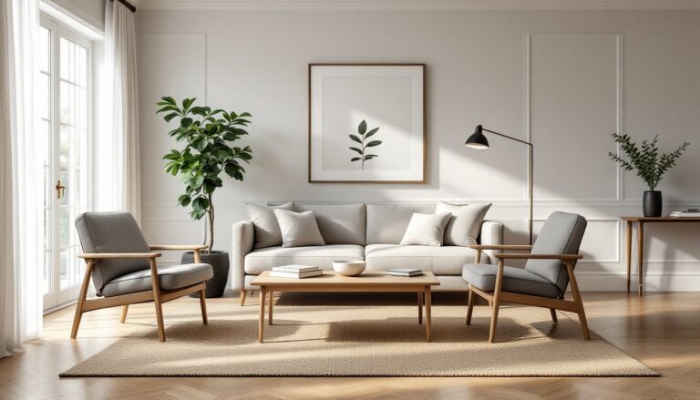
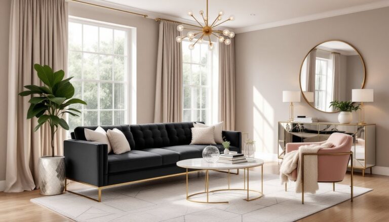
Light blue walls set a neutral-leaning backdrop that opens up plenty of furniture options. White or cream upholstery keeps the space feeling fresh and coastal, while charcoal, navy, or black accents add contrast and visual weight. If you prefer warmer tones, camel leather, rust-colored pillows, or terracotta accents prevent the room from skewing too cool.
Wood furniture works across the board. Light woods (oak, maple, beech) emphasize the airy quality of light blue, creating a Scandinavian or modern farmhouse vibe. Dark woods (walnut, mahogany, espresso-stained pieces) ground the space and add formality, especially effective in larger living rooms that need visual anchoring.
Metallic finishes interact differently with light blue. Brass and gold warm up cooler blues, adding a touch of glam without overpowering. Chrome, nickel, and silver amplify the cool tones, which can feel crisp and contemporary or slightly clinical depending on your other choices. Black metal (in light fixtures, curtain rods, or table legs) works universally and adds a modern edge.
Textiles and patterns introduce personality. Light blue walls handle bold patterns better than saturated wall colors do, think graphic black-and-white rugs, patterned throw pillows, or printed curtains. If you prefer a quieter look, layer different textures in similar tones: linen drapes, a chunky knit throw, a jute rug, and velvet pillows all in whites, creams, and soft grays.
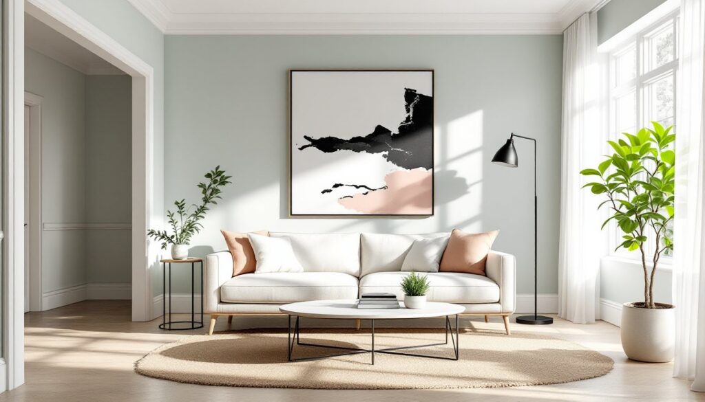
Art and wall decor pop against light blue. Black-framed prints, colorful abstract pieces, and natural wood or rattan wall hangings all stand out clearly without competing. Avoid overcrowding the walls, light blue provides enough visual interest that you don’t need to fill every inch.
For additional design inspiration and room layouts, browse examples of how different furniture styles interact with painted walls in real homes.
Conclusion
Light blue paint colors offer a refreshing alternative to standard neutrals, bringing subtle personality and adaptability to living rooms. By testing samples in your actual lighting, choosing the right sheen, and coordinating with your existing furniture and finishes, you’ll land on a shade that works for years. Prep properly, use quality paint and primer, and don’t rush the process, good prep work makes the difference between a paint job that looks DIY and one that looks professional.