Table of Contents
ToggleA TV stand isn’t just a landing spot for your flatscreen and remote controls, it’s a focal point in most living rooms, and styling it right makes a difference. The problem? Too many accessories make it look cluttered, too few and it feels sterile. Getting that balance takes more than dropping a houseplant on one end and calling it done. This guide walks through practical styling techniques, from managing cable chaos to choosing objects that add depth without turning your entertainment center into a dust-collecting shelf display. Whether working with a sleek mid-century console or a chunky farmhouse unit, these strategies help make the space around the TV feel intentional.
Key Takeaways
- Balance functional media devices with decorative objects using asymmetrical arrangements and the rule of three to create visual interest without clutter in your living room TV stand decor.
- Use plants that tolerate low light like pothos and snake plants, or opt for high-quality faux and dried alternatives if natural greenery isn’t practical for your space.
- Layer objects at varying heights and mix textures—combining materials like ceramic, brass, wood, and linen—to add depth and dimension to your TV stand styling.
- Manage cables with velcro ties, adhesive clips, and hidden power strips to keep the space looking polished and prevent electronic cords from dominating the display.
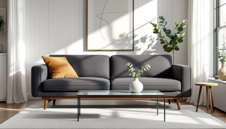
- Style your TV stand to complement its material: warm earth tones for wood finishes, bold accents for light stands, and minimalist pieces for modern glass and metal consoles.
- Curate personal items thoughtfully by rotating seasonal pieces and using shadow boxes for collections to keep the space feeling lived-in without becoming overwhelming.
Balance Decorative Objects with Functional Styling
The best TV stand styling blends what looks good with what actually gets used. Start with the functional pieces, media consoles, streaming devices, speakers, or a soundbar, and build the decorative layer around them.
Symmetry vs. asymmetry: Perfect symmetry (matching candlesticks on both sides) feels formal but can look stiff. Asymmetrical arrangements, a stack of books on one side, a lamp on the other, create visual interest while keeping balance. The trick is matching visual weight, not identical objects.
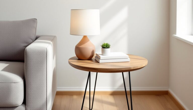
The rule of three: Grouping items in odd numbers, especially threes, tends to look more dynamic than pairs. Try a tall vase, medium picture frame, and small decorative box clustered together. Vary the heights so they form a rough triangle when viewed from the front.
Leave breathing room: Don’t fill every horizontal inch. Empty space prevents the stand from looking like a tchotchke garage sale. If the TV stand has open shelving below, apply the same principle, style one shelf fully, leave another minimal or empty.
Keep remote controls and other daily-use items in a decorative tray or small basket so they’re accessible but contained. A shallow wooden tray works better than a deep bin that becomes a junk drawer on display.
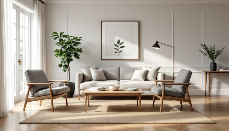
Incorporate Natural Elements and Greenery
Plants soften the hard edges of electronics and furniture, and they’re one of the easiest ways to add life to a TV stand. But not every plant works in every spot.
Low-light tolerance matters: If the TV stand sits away from windows, choose plants that handle indirect light, pothos, snake plants, or ZZ plants are nearly indestructible. Avoid fussy tropicals that need bright sun or constant humidity.
Size and scale: A single statement plant in a 6- to 8-inch pot works on larger consoles. For narrower stands, use smaller 4-inch pots or propagation vases with trailing cuttings. Hanging or trailing plants like pothos can cascade off the edge, adding vertical movement without taking up shelf space.
Alternatives to live plants: If low light or forgetful watering is an issue, high-quality faux plants have come a long way. Look for ones with varied leaf sizes and natural color gradients, cheap plastic greenery is obvious. Dried arrangements (pampas grass, eucalyptus, or preserved moss) add texture without the upkeep, and they suit modern home decor trends leaning into organic materials.
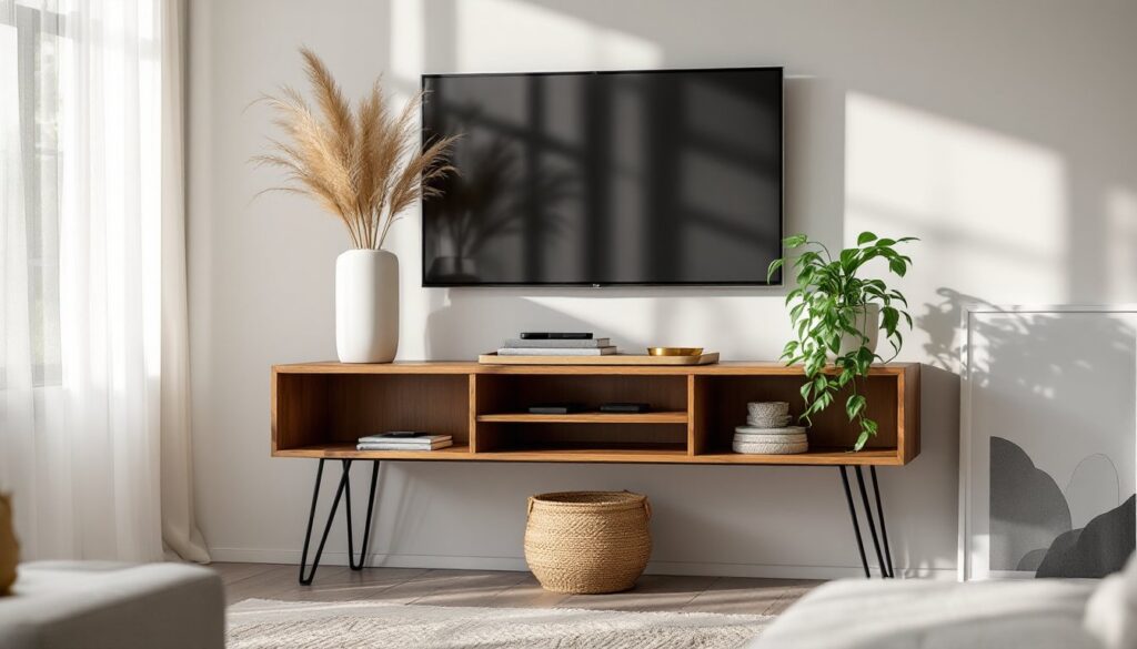
Other natural elements: A piece of driftwood, a bowl of river stones, or a woven basket adds earthy texture. These work especially well if the TV stand itself is sleek and modern, the contrast keeps things from feeling too sterile.
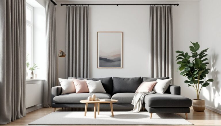
Layer Textures and Heights for Visual Interest
Flat styling looks flat. Layering different textures and varying object heights creates depth, even on a shallow console.
Height variation: Use objects of different heights to guide the eye up and down. A tall candlestick or narrow vase (12–18 inches) anchors one end, while books, boxes, or a low bowl (3–6 inches) ground the other. If everything sits at the same level, it reads as a lineup, not a composition.
Texture mixing: Combine materials with different finishes, matte ceramic, glossy metal, rough wood, woven textiles. A ceramic vase next to a brass picture frame next to a linen-wrapped book creates tactile variety. Avoid too much of one finish: an all-glass or all-wood setup can feel one-note.
Layering objects: Place a small framed print or mirror leaning against the wall, then layer a shorter object (candle, small sculpture) in front of it. This overlapping technique adds dimension, especially on narrower stands where you can’t spread things out horizontally.
Books as risers: Stacked books aren’t just filler, they’re adjustable platforms. A small plant or decorative object sitting on a stack of two or three hardcover books gains height and presence. Choose books with spines that complement your color scheme, or turn them spine-in for a cleaner look.
Manage Cables and Clutter Strategically
No amount of styling works if cables are snaking everywhere. Cord management isn’t glamorous, but it’s the difference between polished and chaotic.
Cable management basics: Use velcro cable ties or zip ties to bundle power cords and HDMI cables together. Route them along the back legs or underside of the stand, securing with adhesive cable clips. If the TV stand has a back panel, drill a 1- to 2-inch grommet hole to funnel cables through neatly (use a hole saw bit if the material is MDF or plywood).
Power strip placement: Mount a surge protector to the back or underside of the stand using adhesive mounting tape or small screws. This keeps the power strip out of sight and prevents a tangle of plugs on the floor.
Hide devices in cabinets: If the console has closed storage, tuck streaming boxes, game consoles, or DVD players inside. Use an IR repeater or wireless HDMI extender if the cabinet doors block remote signals. Make sure there’s ventilation, electronics generate heat, and enclosed spaces can overheat.
Declutter regularly: The TV stand attracts random items, mail, keys, kids’ toys. Set a weekly rule: if it doesn’t belong there, it goes. A small catchall dish or tray can corral truly needed items (the remote, a coaster) without letting the stand become a dumping ground.
Style Around Your TV Stand’s Material and Color
The stand’s finish and material set the tone, styling should work with it, not against it.
Wood tones: A warm walnut or oak console pairs well with earth tones, brass or copper accents, and natural fibers (woven baskets, linen). For lighter woods like ash or birch, cooler tones, whites, grays, matte black, keep things crisp. If the wood has a strong grain or rustic finish, keep decor minimal so it doesn’t compete.
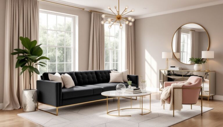
Painted or lacquered finishes: White or light-colored stands offer a neutral backdrop for bolder decor, colorful vases, patterned books, or statement art. Dark finishes (black, navy, charcoal) look sharp with metallic accents (gold, silver, brushed nickel) and high-contrast objects. Avoid too many dark objects on a dark stand: they’ll disappear.
Glass and metal stands: These call for a lighter touch. Too many objects look cluttered on transparent or reflective surfaces. Stick to a few well-chosen pieces, a single plant, a sleek picture frame, maybe a candle. Keep shapes geometric and clean to match the stand’s modern vibe, as seen in many interior design tips focused on minimalist aesthetics.
Mixed-material consoles: If the stand combines wood and metal, or wood and glass, echo that mix in the decor. A metal lamp base on a wood tray, or a glass vase next to a wooden box, reinforces the design language.
Add Personal Touches Without Overwhelming the Space
Personal items, photos, travel souvenirs, collections, make a space feel lived-in. The challenge is displaying them without turning the TV stand into a memory shelf.
Curate, don’t collect: Instead of lining up every family photo, choose one or two meaningful frames and rotate them seasonally. A single 5×7 or 8×10 frame has more impact than six small ones competing for attention.
Shadow boxes and small displays: If there’s a small collection to show off (vintage cameras, seashells, matchbox cars), use a shadow box or display case to contain it. This keeps the collection visible but organized, rather than scattered across the surface.
Rotate items: Swap out decorative objects every few months to keep the space feeling fresh. Seasonal swaps (a vase of branches in fall, a bowl of ornaments in winter) are an easy way to shift the look without a full redesign.
Avoid logo overload: Branded items, sports team gear, movie posters with text, corporate swag, can feel cluttered visually. If displaying them, balance with more neutral pieces. A team pennant in a simple frame reads better than a row of bobbleheads, according to interior design ideas that emphasize cohesive styling.
Art and prints: Lean a piece of framed art against the wall behind the TV stand for an effortless gallery vibe. Choose something that doesn’t fight with the TV for attention, abstract shapes, line drawings, or black-and-white photography work well.
Conclusion
Styling a TV stand isn’t about following a formula, it’s about balancing function, personal taste, and the realities of daily use. Keep cables out of sight, vary heights and textures, and don’t be afraid to edit down. A well-styled entertainment center should feel intentional, not staged, and it should work as hard as it looks good.