Table of Contents
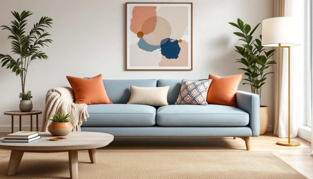
ToggleA light blue couch anchors a living room without dominating it. It’s soft enough to work with neutrals, bold enough to carry color, and flexible enough to shift between coastal calm and contemporary polish. Unlike navy or charcoal, light blue doesn’t box you into a single style, it adapts to layering, texture changes, and seasonal swaps. Whether upgrading a dated sofa or planning a full refresh, a light blue upholstered piece offers a foundation that homeowners can build around for years without feeling locked into a trend.
Key Takeaways
- A light blue couch acts as a flexible design anchor that adapts to multiple styles—from coastal to contemporary—without limiting your decor choices or locking you into a passing trend.
- Light blue works as a neutral with personality that pairs seamlessly with warm accents like terracotta, brass, and natural wood, while reflecting daylight to make smaller living rooms feel airier and more open.
- Texture and tone matter more than color in neutral schemes; layering linen, velvet, boucle, and chunky knits with varying shades of gray, beige, and cream creates visual interest without competing for attention.
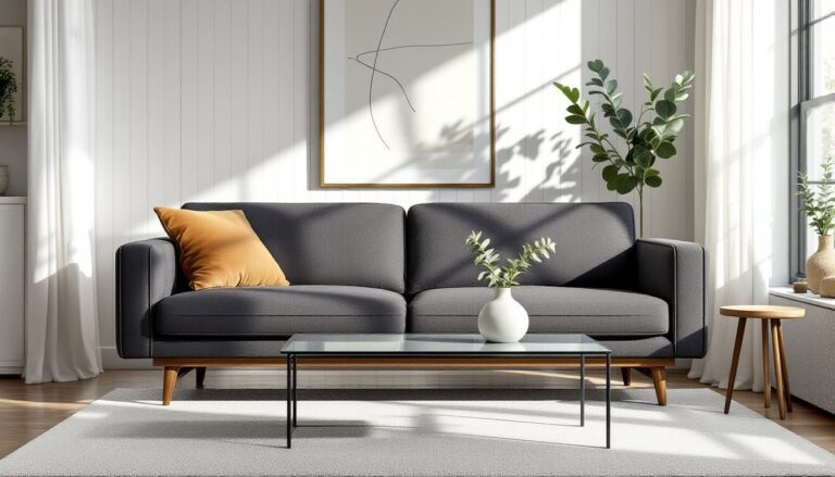
- The 60-30-10 design rule ensures balanced styling: keep 60% neutral backgrounds and large furniture, dedicate 30% to your light blue couch, and use 10% for bold accent colors like coral, mustard, or emerald in pillows and accessories.
- Choose hardwood flooring in medium to dark tones like walnut or espresso, and pair your light blue couch with large 8’×10′ rugs in neutral or patterned designs to ground the space and unify the seating area.
- Strategic lighting with warm white bulbs (2700K–3000K) and intentional layering of overhead, task, and accent lights make a light blue couch feel warm and inviting rather than clinical or cold.
Why Light Blue Couches Are Perfect for Modern Living Rooms
Light blue works because it registers as a neutral with personality. It reflects daylight without the clinical feel of white or gray, making smaller living rooms feel airier. In open-concept layouts, a light blue sofa defines the seating zone without creating a visual wall the way darker furniture can.
From a design standpoint, light blue sits comfortably in the cool spectrum, which means it pairs easily with whites, grays, taupes, and greens, colors already dominant in modern interiors. It also handles warm accents better than you’d expect. Terracotta, brass, and natural wood don’t clash: they create contrast without tension.
Upholstery-wise, light blue hides less than white but shows stains more than charcoal. Performance fabrics like Crypton or Sunbrella are worth considering if the couch will see heavy use, pets, or kids. These treated weaves resist moisture and staining without the plasticky hand of older synthetics.
Light blue also photographs well, which matters if resale or staging is anywhere on the horizon. It reads as intentional rather than safe, and that’s a narrow but valuable lane in real estate staging.
Coastal-Inspired Living Room Design with Light Blue Sofas
Coastal doesn’t mean nautical kitsch. Done right, it’s about texture, light, and a restrained palette that feels like summer without the anchors and rope.
Start with natural fiber rugs, jute, sisal, or seagrass. They ground the space and add tactile contrast to smooth upholstery. Avoid high-pile rugs here: the coastal look leans into flat weaves and organic imperfection.
For walls, stick with whites that have warm undertones, Alabaster by Sherwin-Williams or White Dove by Benjamin Moore. Cool whites can make light blue feel icy instead of breezy. If painting trim, go semi-gloss to bounce light around.
Layering in weathered wood tones, driftwood gray, sun-bleached oak, keeps the palette grounded. Coffee tables, media consoles, and open shelving in reclaimed or wire-brushed finishes add age and texture without competing for attention. Incorporating ideas from modern coastal interiors can help refine the balance between beachy and lived-in.
Accessories should stay organic: linen curtains in off-white, ceramic table lamps with crackle glazes, or woven baskets for storage. Greenery works, but skip the tropical. Olive branches, eucalyptus, and succulents fit better than palm fronds.
Avoid the temptation to add too much blue. One light blue sofa is the anchor. Overdoing it with blue pillows, blue walls, and blue art turns the room monochromatic in a flat way.
Pairing Light Blue Couches with Neutral Color Palettes
Neutrals let a light blue couch breathe. The trick is varying tone and texture so the room doesn’t flatten into blandness.
Grays are the most common pairing. Go warm, greige or taupe-gray, rather than cool slate. Cool grays can make light blue look washed out or medicinal. A warm gray on the walls, like Agreeable Gray or Revere Pewter, creates a soft backdrop that makes the couch pop without shouting.
Beiges and taupes work especially well if there’s natural wood in the room. They bridge the gap between the couch and wood tones in flooring, trim, or furniture. Beige doesn’t mean boring, look for layered tones in throws, pillows, and area rugs to add depth.
Whites and creams keep things light and open. This combination suits small living rooms or spaces with limited natural light. Cream-colored throw pillows, a white shag rug, and pale wood furniture create a Scandinavian-inspired simplicity that’s easy to maintain.
Texture becomes critical in neutral schemes. Swap flat cotton for linen, velvet, boucle, or chunky knits. A linen throw in oatmeal or a boucle accent chair in ivory adds visual interest without introducing new colors. When working with neutrals, exploring paint and decor pairings can offer fresh perspective on balancing undertones and finishes.
Metallic accents, brushed nickel, aged brass, matte black, also work as neutrals here. Picture frames, lamp bases, and curtain rods in mixed metals add a layer of polish without color.
Bold Accent Colors That Complement Light Blue Upholstery
Light blue plays well with stronger colors, especially if you’re ready to move past the all-neutral look.
Coral and terracotta bring warmth without overpowering. A coral velvet pillow or a terracotta ceramic vase creates instant contrast. This pairing feels current, think desert modern or updated midcentury. It’s grounded and energetic at the same time.
Mustard yellow is another strong move. It’s bold but not brash, and the yellow-blue contrast is a classic color theory win. Use it sparingly: a mustard throw, a pair of pillows, or a painted side table. Too much yellow can tip the room into preschool territory.
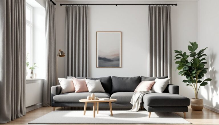
Blush pink softens the palette while adding dimension. It’s a gentler contrast than coral, working well in bedrooms or living rooms that double as quiet retreats. Blush pairs especially well if the light blue leans slightly gray.
Emerald or sage green taps into the analogous color scheme, colors that sit next to each other on the wheel. The result is harmonious rather than jarring. Velvet pillows in deep green or a sage linen chair create a layered, sophisticated look.
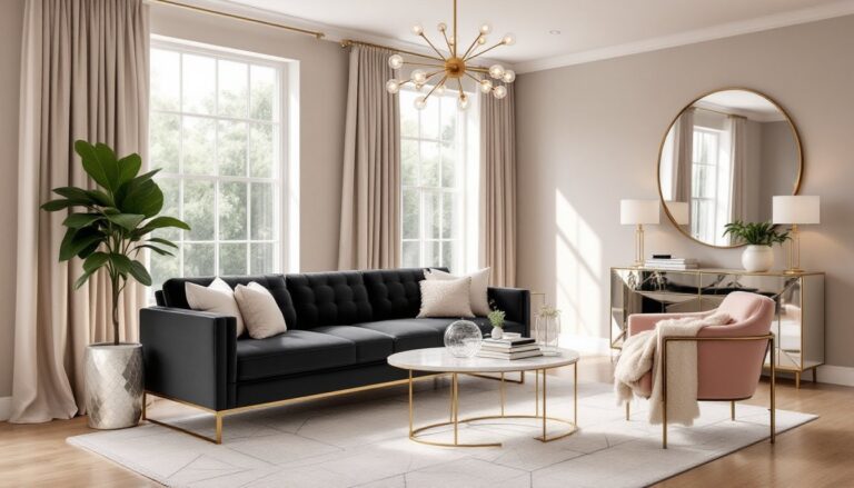
Navy or charcoal adds weight and grounds the palette. A navy accent wall behind the couch or charcoal side chairs create contrast without introducing a new hue. This move works well in modern or transitional spaces where structure matters.
When using bold accents, follow the 60-30-10 rule: 60% neutral (walls, large furniture), 30% the dominant color (light blue couch), and 10% accent color (pillows, art, accessories).
Choosing the Right Rug and Flooring for Your Light Blue Couch
The rug and flooring set the tonal foundation. Get them wrong and the couch floats awkwardly: get them right and the whole room clicks.
For hardwood or laminate flooring, medium to dark wood tones work best. Light blue against honey oak can look dated: light blue against walnut or espresso feels intentional. If you’re installing new flooring, luxury vinyl plank (LVP) in a gray-washed oak or driftwood finish gives flexibility and durability at a lower price point than hardwood.
Area rugs should either anchor or complement, not compete. A large 8′ × 10′ or 9′ × 12′ rug should sit under the front legs of the couch, extending beyond the seating area to unify the space.
For patterns, consider:
- Geometric or abstract designs in navy, cream, and gray for a modern look
- Traditional Persian or Turkish rugs with faded reds and blues for a layered, eclectic vibe
- Striped or tonal rugs in cream, beige, or gray for a clean Scandinavian aesthetic
Avoid rugs with too much light blue, they’ll wash out the couch. A rug with light blue as an accent color works: one that’s predominantly light blue creates a monochrome puddle.
Texture over color is a safe bet. Natural fiber rugs (jute, sisal, seagrass) or low-pile wool in neutral tones let the couch be the statement. If going for bold color, use the rug to introduce your accent hue, coral, mustard, or emerald, so the palette feels cohesive. Homeowners looking for visual examples can check furniture and rug pairings to see how different textures and scales interact in real spaces.
Styling Tips: Pillows, Throws, and Accessories
Accessories are where personality happens. A light blue couch is a clean slate, don’t waste it with generic styling.
Pillows
Start with three to five throw pillows in varied sizes: two 22″ × 22″, two 18″ × 18″, and one 12″ × 20″ lumbar. Mix textures and patterns:
- One solid in a bold accent color (coral, mustard, emerald)
- One patterned (geometric, stripe, or subtle floral)
- One textured (boucle, velvet, linen)
Avoid matching pillow sets. They look catalog-flat. Instead, pull colors from the rug or artwork to tie the room together.
Throws
A 50″ × 60″ throw blanket in chunky knit, waffle weave, or linen adds warmth and visual weight. Drape it over one arm or fold it lengthwise across the back. Colors that work: cream, oatmeal, charcoal, or a muted version of your accent color.
Avoid synthetic fleece, it pills quickly and looks cheap in photos. Stick with cotton, linen, or wool blends.
Coffee Table Styling
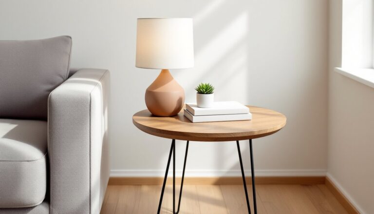
Keep it simple: a small stack of books, a ceramic bowl or tray, and one organic element (a potted succulent, a piece of driftwood, or a small vase). Avoid clutter. The coffee table should look curated, not crowded.
Wall Art
Abstract prints, black-and-white photography, or large-scale botanical prints work well. Frame in natural wood, black, or brass depending on the room’s overall tone. Hang art so the center is at 57″ to 60″ from the floor, standard gallery height.
Lighting
Layer lighting with a mix of overhead (pendant or chandelier), task (table lamps), and accent (floor lamps or sconces). Warm white bulbs (2700K to 3000K) make light blue feel cozy rather than cold. Avoid cool daylight bulbs in living spaces.
Conclusion
A light blue couch isn’t a decorating risk, it’s a flexible anchor that adapts to shifts in style, season, and personal taste. Whether leaning coastal, neutral, or bold, the key is intentional layering: texture, tone, and a few well-chosen accents. Start with the foundation, flooring and rugs, then build up through pillows, throws, and lighting. The result is a living room that feels pulled together without looking over-designed.